
01: family hq
can I just say, that this app is already making me feel like it's totally unnecessary.’
rachel, mother of two, one with high needs
trying to sell a story before knowing the plot.
each interaction can be pleasurable or cumbersome depending on how that experience is planned. inconsistencies in a product’s blueprint form plot holes into which the flow or logic for the user fails.

beginning
handover.
evolved out of a perceived common struggle of caregivers’ to keep track of medications and action plans, the family hq app is a place to record and manage relevant information about a family’s health and medication needs.
our brief was to evaluate the current-state user experience, examine on-boarding, and help build resonance in the client’s value proposition with their naive audience.
our key objectives were to create a service out of their start-up product by helping to distil their value proposition and align their product with their explicit value offering, and support user goals and intentions by addressing violations of design heuristics in the product design.

doing the vitals.
to deliver data-informed recommendations on achieving a robust business model going forward, we had to thoroughly understand and assess the current-state. in our discovery phase, we ran a fine-tooth comb through the subjective and objective usability of the app, and reviewed family hq’s online presence, including testing the first impressions on a naive audience.
our discovery data revealed the app was feature heavy and arduous to navigate, with numerous interruptions and gaps in the user flows. the subscription process was convoluted and had major back-end errors, making successful subscription unlikely. populating the app was compounding the adverse user experience by consuming a lot of time, and comments about being administratively laborious were recurrent. clear on-boarding had yet to be integrated into the branding and web design, and our interviewees responded with confusion over what the product delivered.
in summary, there was a lack of bleed through; a disconnect between what the product claimed to be and do, to what the product had and did.

prescription.
the idea of building out design, is not about feature-adding. a nuanced approach, one that balances the need for brand attraction with delivering on functionality, bleeds value into all channels of the product development through data-informed decision making.
user input is one of the most informing things.
understanding what users are thinking and looking for before adding buttons, makes for delightful design. the key to usability is making it an iterative process.
pure medicine.
pragmatic usability rating by experts
pure methodology is focused on just one component of user experience: ease of use. the precept of pure is as a low-cost, time-efficient usability evaluation method. used in conjunction with other measures, pure scores fill in an important gap left by the limitations of traditional metrics that can leave out the why a user had a specific experience and typically produce indirect indicators of the quality of the user experience; reflective of software performance, not human interactivity.
to understand the points and level of friction experienced by users, we adapted pure methodology into a light contextual play. we gave naive users pre-defined goals, and recorded the reasons for their navigation choices and scored their progress in achieving those goals using a traffic light colour-code system representing levels of friction. the greater the friction experienced, the hotter the colour; the opposite of ease of use.
this traffic light colour scheme also doubled as a simple demonstration tool when trying to convey research data in an easy to digest way to the product owners.

neural pathways.
customer journey maps morph the process of synthesising, empathising, and solution selling. they bring to life data from research activities and go some way in shining a light on the personal story of the user in the context of a specific business enterprise and/or interactivity.
a comprehensive customer journey map was developed out of our research insights. it was employed as a graphic aid in mapping out the caregivers’ actions and needs with their corresponding thoughts and feelings as they progressed through the phases of discovery of family hq to engagement in the app. the intention was to help transport the product creators into the lives of their target audience.

we are noticing potential customers aren't seeing the value. we want to address this; how do we make our value explicit?’
- sarah, co-founder of family hq, rural emergency doctor
blood flow.
a value proposition is a promise of value to be delivered. this promise explains succinctly how your product solves problems/improves situations, and what specific benefits users can expect. a value proposition isn't about telling what the product is, but how it will help.
your value proposition is the core of your competitive advantage. clearly articulating the ingredient of your business that solves a problem competitors can not, is one of the most important conversion factors; equally as relevant in the context of closing a sale, as it is in securing funding, and designing a seamless experience.
we are trying to solve many things, and different things for different families… this becomes a problem for us when we are pitching for funding.’
- sarah, co-founder of family hq
to pull liz and sarah out of their spinning hamster wheel of features, and on to successful funding rounds, we led them through a value prop setting workshop to better understand their offering and how they might build out their service. it was begun by identifying their audience, and then stretched out in a brainstorm on their users’ jobs-to-be-done.
essentially this is an empathy building exercise: the client needs to consider what are the hurdles the customers are facing in getting the jobs done, and how might they heal these pain-points and make it easier for the customer. linking these benefits to value, starts to feed the develop phase of ux design process.

middle


diagnosis.
at the core of good interaction and experience designing lies credibility and value. these qualities are imbued into the tiniest parts to craft a solution that is controllable, learnable, and causes delight.
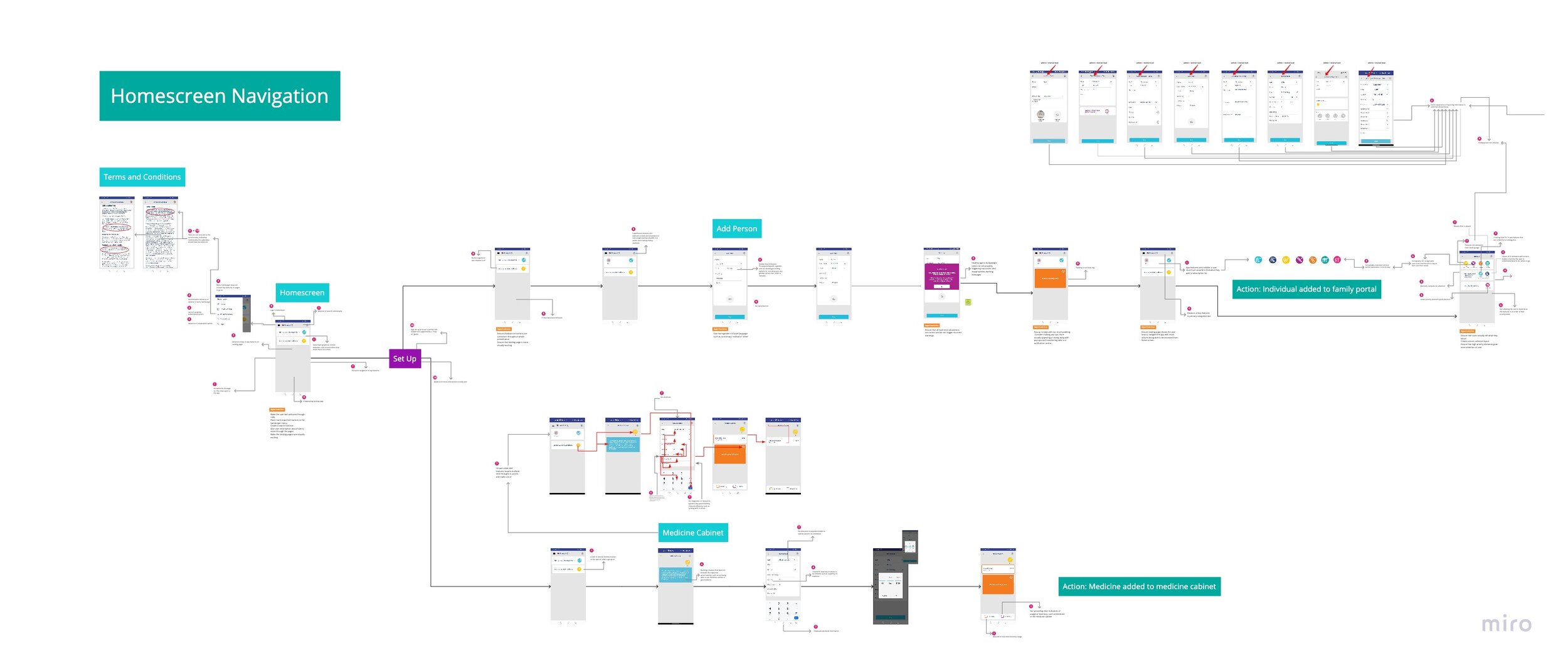
to get a grasp of the sequences of a trigger moment through a series of steps to successfully achieving a goal, we constructed a scheme of wireframes using screenshots of the existing app. this gave us a picture of how the solution/navigation was, or was not, meeting the needs and wants of the user of the interface. to add depth and constructive detail to these high-level job flows, we overlaid annotations pin-pointing heuristic violations and highlighting opportunities for improved interactivity, revealing how the granular level builds into the aggregate.
combining sequences of screenshots with annotations relating to specific design principles, helped us get a better sense of what we had observed and learned, and called attention to plot holes in the product narrative: from back-end dev through to user-interface design. this was also very helpful when sharing our user research with liz and sarah, and providing them with remedies.
the skeletal structure.
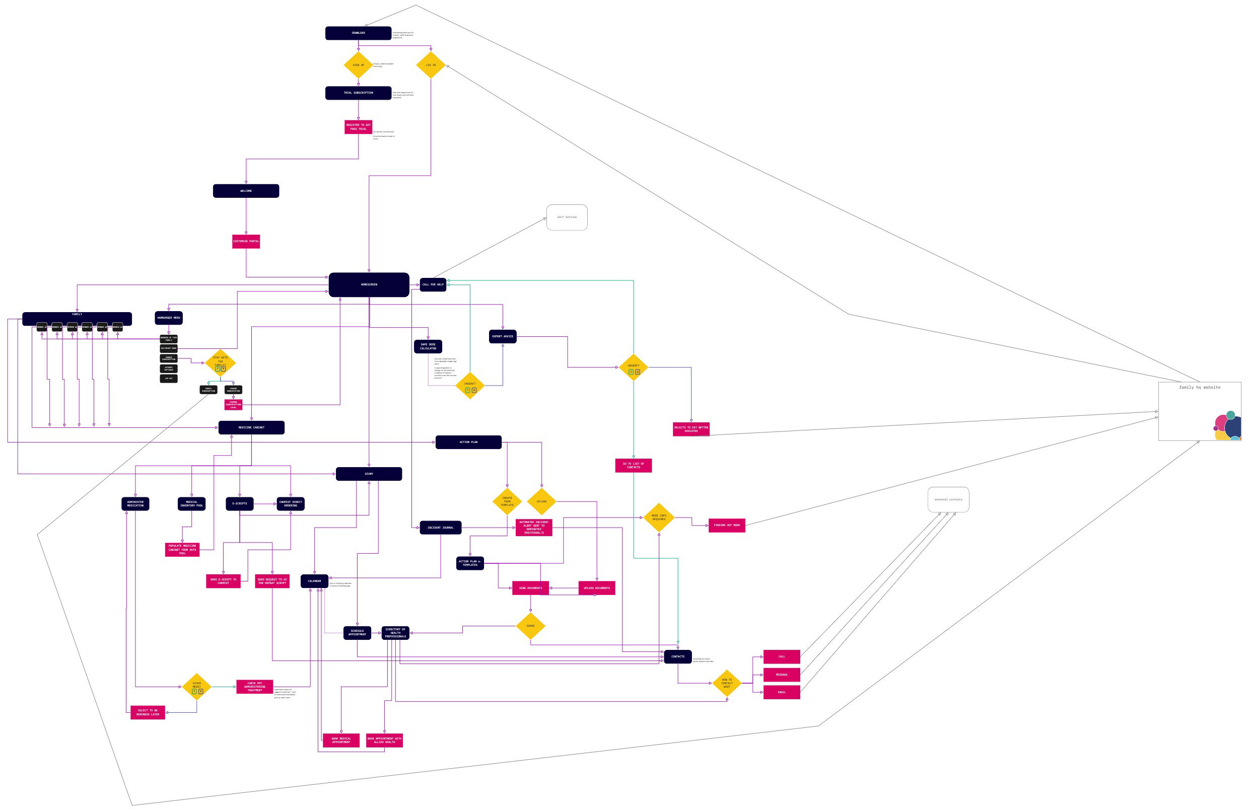
rudimentary ia
sarah and liz were digitally naive and they needed information broken down to digestible parts to be able to plan better. this meant triaging the insights we garnered from user research into plain-speaking recommendations and drafting a simplified site-map to redress plot holes in their narrative and product development. to support back-end development we drafted a future-state site map based on our heuristic evaluation and user insights to establish a common language between the makers and the parts.
information architecture is to interactive design, as blueprints are to bricks-and-mortar construction; amongst a large number of things competing for attention, ia provides the logic.

end
respiration.
not unlike the interrelated systems of the human body, collaborative designing sees peers responsible for different parts of the customer and user experience, working in conjunction to create a seamless process and product.
dovetailing design thinking between the building-out tenet of SD and the zoom-in of UX, gave our inter-disciplinary team the opportunity to close the gap in the current-state offering, using the research data to refine the service blueprint and carefully curate the information architecture for efficient back-end dev and user flow. site maps charted the structure, user flows predicted frictionless pathways, customer journey mapping brought the client closer to the user, and colourful priority matrixes took vast, complex information and presented it in an easily digestible way for quick reference.
most of the fragile insights that lay the foundation of a new vision emerge not when the whole group is together, and not when members work alone, but when they collaborate and respond to one another in pairs.’
- michael p. farrell, professor of sociology
pairing service design and user experience on this project enabled the team to progress simultaneously on aligning usability and value, and leveraging this strategic advantage for our client in the development of their start-up. the communication between the viewpoints helped suture plot holes in the family hq narrative to move the future design away from feature bloat, and towards a product that spoke of an explicit benefit: reducing mental load of caregivers. this was expressed in a minimal aesthetic and navigation, and simple conversion fixes that elevated first impressions.

epilogue
triage.
how you marry the perception of your product with the experience for the end user, prescribes how deeply they resonate with your story and determines the value they receive.
experience designing is an endless process of diverging and converging on user experience. systems diagrams and site-maps chart the lay of information, and are indispensable in predicting and illustrating potential journeys for unobstructed user flows.

5-seconds-testpure methodologyheuristics evaluationsystem usability scalevideo interviewingvalue prop settings.w.o.t.research synthesisannotated wireframesuser flowscustomer journey mappinginformation architecturesite mappingvisual priority matrixremote usability testingpresentation deck
mirofigmatrelloslackgoogle formszoomotterg-suitecanva
empathystakeholder workshopadministrationcross-collaborationperceptioncolour psychologyco-creationcustomer experienceservice design thinkingproduct strategypublic speaking