
03 pearlii
social chomp.
bracing for engagement
an experience is a memorable event staged like a play.
the choreography of the parts, forming a system of interrelationships that is not just transferring data and facts, it is a dynamic exchange of energy whenever a product is used, an image is seen, or a game is played.
are you ready to rinse away the daily grind of oral hygiene and give your social kudos that golden filling ?

brusha brusha brruu-sha.
hinged on a philanthropic ethos to end dental poverty, the pearlii app is looking set to bridge a cavity in access and affordability with free ai powered dental health check-ups.
with the aim of improving user engagement, pearlii was considering how to excite desirability and foster loyalty to their product. we were to take the exisiting app development data and, coupled with our fresh research, determine feasibility of a stand alone ‘share your dental story’ feature that the client believed would allure and retain users to the pearlii app.

beginning
routine check up.
for our solution to augment with the dental health assessment app at both a software level and marketing, continuity in the experience was crucial. to achieve this, a review of the current-state was fundamental to designing a dynamic exchange of energy between the two parts of the same product and maintaining the bleed through of value and brand.
at a coarse level, the line between contextual and cliche was faltering, and this made for a loss of credibility. copy was not being used as an integral component of creating context and style and desirability, and visual hierarchy appeared to lack a north star.
at a granular level the absence of small calls-to-action, such as the option to like blog posts, meant there was plenty of room for simple fixes to make a big difference too.
in our evaluation, the product website had not yet shifted emphasis from object to action. so whilst the product appeared usable, it had not yet become desirable.
pleased tooth meet you.
the client had communicated that their core prerogatives were engagement and retention, which went beyond simply investigating the feasibility of a dental story sharing feature.
keep them on, bring them back.’
- dr kyle turner, ceo and founder, pearlii
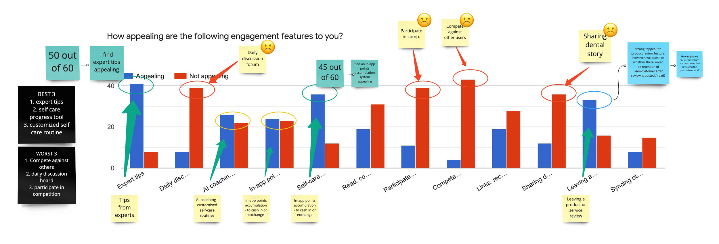
to diverge on this, our research survey was designed with two objectives in mind: to understand the receptiveness to the dental story sharing feature, as well as a broader enquiry about what are successfully engaging features.
typically surveys are conducted in the strategise phase of product development when designers are considering new ideas and opportunities. the goal, therefore, is to inspire exploration.
our team collaborated in creating a survey with a one-two-punch strategy, combining both quantitative and qualitative questions. to ensure our data did not fall prey to the ux maxim ‘only thing worse than no data, is bad data', the survey was put through a number of peer tested iterations to better meet our objectives before going live.
drilling down.
user interviews are a foundational user-centered design method to learn what a participant thinks and feels and how they behave in relation to a topic.
interviews are an opportunity to dive deeper for actionable data. performed with due purpose and rigour, they are used to understand what a user is trying to do and what isn’t working for them, not just what they like and don’t like. it also enables the moderator [the designer/design team] to observe the actions, emotions and body language of the participant directly.
a stand alone feature capable of attracting and retaining users, would need to lean in on user emotions to engage them in an emotional journey. user interviews gave us those invaluable insights.
our users favoured pragmatic apps, ones that helped them complete day-to-day activities, but when they were bored their attention was piqued by interesting words, click-bait headlines, news and expert advice, games and features that hooked them with interaction and play.
all this material added ever increasing detail and depth to the world of the consumer, giving us our why and informing how we might design a memorable pearlii experience.

oh my, what big teeth you have.
from a reactionary perspective, it sounds like a novelty feature that I would use once and then likely never return to it again.’
- interviewee
the results of the research into the primary feasibility objective, proved that the share your dental story feature was not enough to breach the challenges of app engagement. the client’s idea had fallen flat in the view of their intended user. it did not have enough appeal to stand alone and we were headed for a rather delicate operation of stakeholder management to carefully extract the dental-story-sharing brainchild from the arms of the creator: the ceo.
with the data declaring our need to pivot, our team shifted focus to the broader inquiry on app engagement, and how we might strike a balance between usefulness and entertainment. directed by our research findings and current-state evaluation we agreed on a content first approach to fully appreciate the user’s perspective. when it came to achieving fun interactivity, the end-user wanted a solution that had expert advice, game play and tracking of progress. content could not be left vulnerable to blame for abandonment of the feature.

the key to big results is to understand app engagement’s biggest challenge — that consumers are spoiled for choice in ways to spend their time, and at the same time, they stick to their habits.’
— braze magazine, how to outsmart the industry's pain points

middle

jenny is a busy young professional, on a quiet mission to improve the environmental credibility of her workplace. she values her own time and relies on tech for pragmatic reasons. she confesses she needs a prod or two to get through the daily grind and resorts to apps to set reminders of things to be done. she believes people fabricate their personal stories for effect when posting to socials and doesn’t care to be writing anything personal on a public forum. she'd like to do more to address her concerns about poverty yet struggles to find worthwhile ways to make a difference without disappearing down some rabbit-hole of political activism.
craig is an adept selfie-stick-wielding university student. he’s admittedly a little vain and scours socials for beauty and health tips when he’s bored with study. he’s a closet spreadsheet-ist, keeping track of progress on his diet and fitness goals. he’s a junkie for new apps but unless there’s an incentive to stay, he aint hanging around out of misplaced loyalty.
selfies.
the process of creating personas helps the design team work with their users in mind and to build empathy. critiquing design solutions from the perspectives of different personas gets designers to think beyond their personal likes and dislikes or their own creative investments. it is an exercise in challenging our own biases and egos.
personas are active, they posses behaviours and values, desires and hang-ups, and are not stereotypical. they are manifested out of research that is specific to the project. and just as people change over time so must personas be re-examined and relevant to the value proposition of the business.
jenny and craig humanised our data. they were a product of new patterns we had found in user research, and gave us the necessary frames for ideation. overlaying our fresh qualitative data over the pre-existing personas, rounded out their characters and brought them to life as the central dramatis personae of our project storyline.
what’s the floss.
[to keep me as a regular user of a dental health app i’d want] incentives, self checking, whiteness checking, ways to self-help with products, tips on enamel care. that kind of thing.’
- survey respondent
we had established that expert advice and self-care functionalities appeal to jenny and craig the most. now we needed to design the motivation for jenny and craig to adopt a new product.
cue crazy eights.
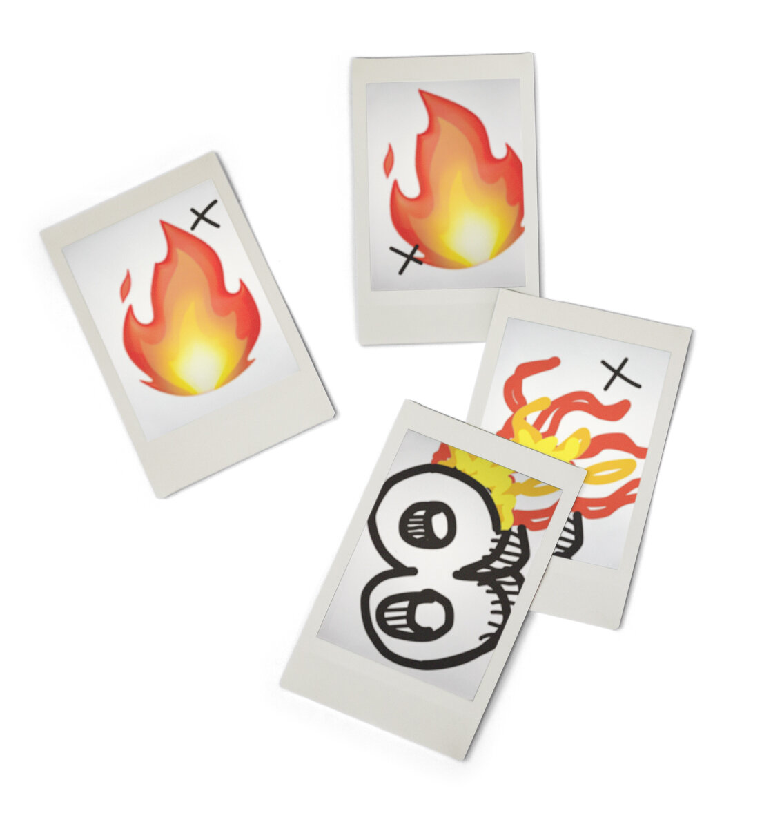
crazy eights is a core ideation method of sprint designing and a brilliant ice-breaker in participatory design, which was certainly a strong motivation for getting our clients involved. the fast sketching exercise in which participants ideate one solution per minute for eight minutes to pre-determined end-user problems, is a quantity-over-quality exercise to generate a number of different ideas in a short space of time.
stakeholder management is the process of maintaining good relationships with the people who have most impact on your work.’
- mind tools
playing crazy eights with the stakeholders gave us the opportunity to be face-to-face with them in an informal, lightly social setting. the act of collaborating with the client to tackle how to design the functionality, helped cushion the impact of hearing us speak of the negative results of our feasibility testing. the professional camaraderie helped make them more receptive and trusting of our novel approach going forwards.
canine to K9.
visual prioritisation matrices
minimal viable product & likert scales
in our endeavours to satisfy the varied needs of the user and the business, collaborative designers look to democracy to prevent the loudest person in the room from dominating the outcome. in ux, the success of a project is determined by the group’s ability to find consensus through structured, objective methods of prioritisation, and voting.
visual prioritisation matrices are, as the name would suggest, visual tools for mapping items along axises to help decision makers think about how variables interact, or the intensity of attitudinal responses along a line. these simplified matrices are completed through surveys and a process of debate and polling, until a group consensus is achieved on the placement of the items on the chart or scale.
a minimal viable product matrix [mvp] is a lean way to plot items, validate them and ensure the intended impact. items for consideration are plotted on an x/y axis charting value to the user balanced with effort for the client. ‘minimal’ is not to be confused with least functionality, cheapest. minimal must coalesce value with effort and our mvp exhibited gamification and progress tracking as the most viable product strategies. the mvp could be incentivised in part by giving to a social cause to establish the return on the client’s philanthropic endeavours.
a likert scale is a popular tool in psychological assessments. when used in the user-experience context they can depict the intensity of attitudes to a subject, from strongly disagree to strongly agree. our likert scales displayed intense dislike of sharing personal stories, dental or otherwise, in online public forums, whilst useful apps that helped with managing day-to-day errands were heavily favoured. such visualisations showed the priority functionality that our solution would need to deliver to successfully attract and retain pearlii’s end-users.

a knowing smile.
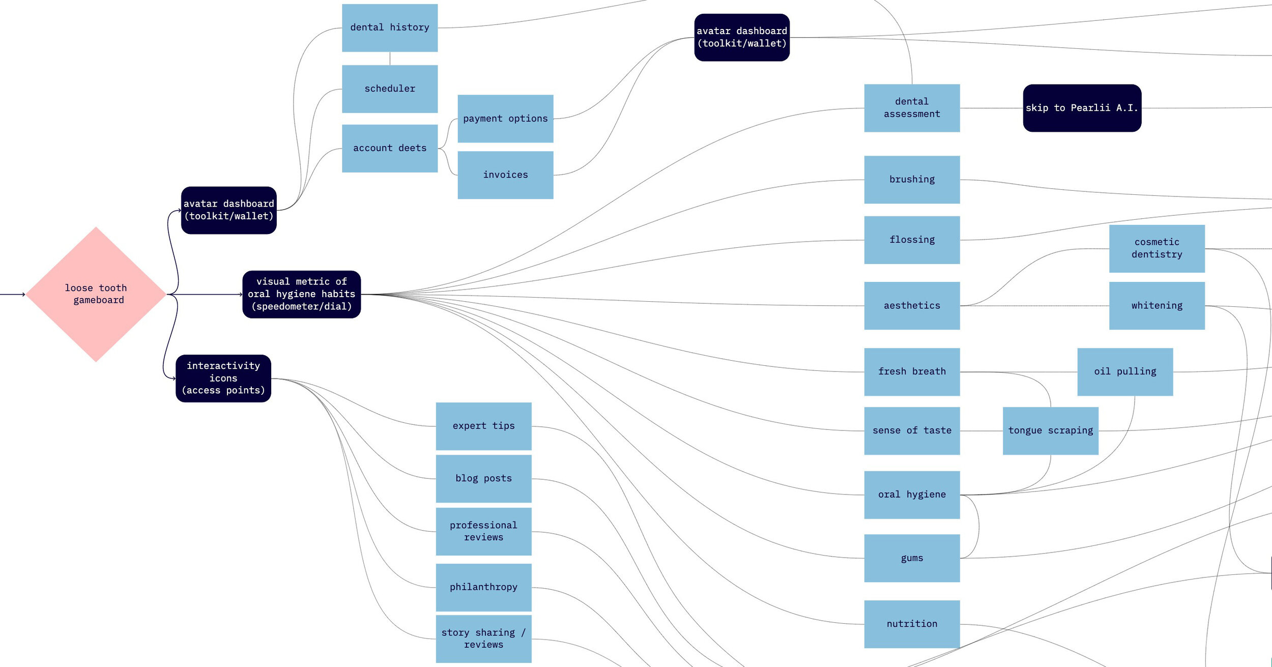
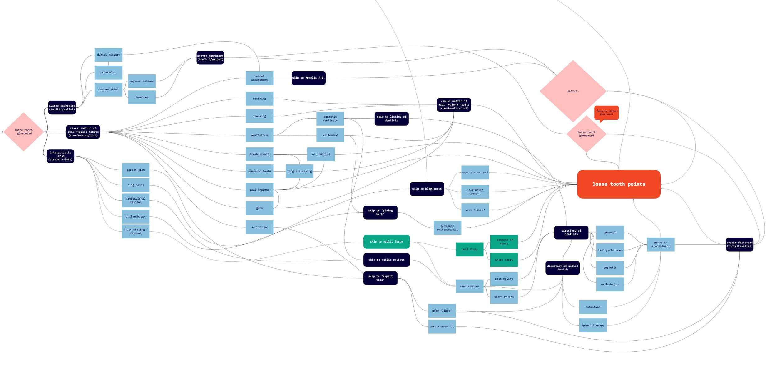
diagramming ideas as future-state user flows displays potential sequences of touch-points sans constraints of user-interface technical parameters. the flow lines join the multitude of parts together to reach goals, along pathways customised by the users’ choices and actions. this became a crucial artefact for the client; a study that brought together the energy flow of the user with the client’s ambitions.
what is exciting about design is the potential to transfer information into another person’s mind, the way storytellers can and do. by playing with the relationship between parts and wholes human centered designers prompt mental work from users, making a system of touch-points come alive in people’s minds, inviting users to actively participate.
this shift in paradigm is the calling card of experience designing.

an experience isn’t just consumed in the moment. it engages consumers in a theatrical performance, creating a lasting memory and an emotional bond.’
- senior curator of contemporary design, cooper hewitt,
smithsonian design museum
the getting of wisdom [teeth].
a key take-away from our research was that products that engage are personal. they help build new skills, they help make sense of the unfamiliar, and help to navigate chaos. they create an environment of credibility and provide the user a sense of purpose even in the mundane.
the deficits in visual hierarchy and copy we noted in our heuristic evaluation of the website prompted the team to stick with a content-first strategy. content must be user-tested and iterated to reach ux writing status. nailing the right tone of voice and communicating personality from the get go would mitigate abandonment of users at their first contact.
followership is what completes the dynamic exchange of energy that elevates a product from a gadget to an experience.
followership is active participation, and we needed to find a way to ignite this. what we can also confer from organisational theory is that disengagement begins in disappointment with the quality at the top level of interactive design.

end
gamification is a big way that other apps for mundane, day-to-day tasks, have kept me going back. whether that's through achievements or in-app point collection.’
- interviewee
jaw dropping.
gamification
/ˌɡeɪmɪfɪˈkeɪʃ(ə)n/
noun
the application of typical elements of game playing to other areas of activity, typically as an online marketing technique to encourage engagement with a product or service.
gamification describes the incentivisation of people’s engagement, by using game-style mechanics in non-game contexts.
we had created a way to leverage users natural tendencies for competition, collaboration, achievement and charity, and to carry the dental story sharing feature within a gamified framework of engagement. this framework was designed out of what appealed most to jenny and craig, and incentivised greater philanthropic involvement in so far as social kudos for both user and client alike.
ux design isn’t just focused on creating products that are usable. we seek a cohesive, integrated set of experiences by concentrating on aspects of pleasure, efficiency, and fun too!
we wanted our solution to be more than just a gadget. a solution stimulating desire, sharing, and inviting a longer stay. we aimed to have it hum with social activity and for ux writing to have a starring role in achieving that. gamification became the circuit breaker in both ideation and stakeholder management, and having real content during prototype testing and iterations made for successful user-curated copy.


loose tooth.
a game with serious social chomp
arm yourself with with a belt of dental floss, a bright smile and a bottle of mouthwash and get ready to take up the call to end dental poverty!


epilogue
mouthwash.
design with real content
content is meant to move your users in specific directions. it exists to ensure there is a cohesive narrative to the experience and yet a common mistake with designing prototypes is to use generic text and silly names. not only can this be distracting but it can even bias your test results.
good writing reduces ambiguity. it is specific, concise, readable, contextual, consistent, and executed in plain language. it imbues a sense of style, conveys emotion, feeling and personality.
good copy communicates more than information, it is telling a story.

surveysolution comparison analysisaffinity mappingone-on-one interviewslikert scalepersonaspoint-of-viewhow might we questionscrazy eightsmvp matrixcomplex user flowsinteractive prototypeux writingremote moderated prototype testingpitch deck
figmamirotrelloadobe photoshopg-suitezoomgoogle forms
storytellingdata artinnovationvisual instructionexperience economycreative copystakeholder engagementcollaborationorganisational theoryword-smithinggamificationcontent strategyinteraction design thinkingworkshoppingparticipatory designproject leadif you want to stand out, use interesting words.’
9 year old friend of my daughter